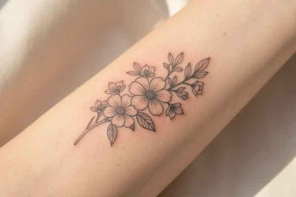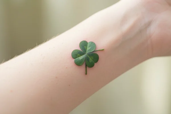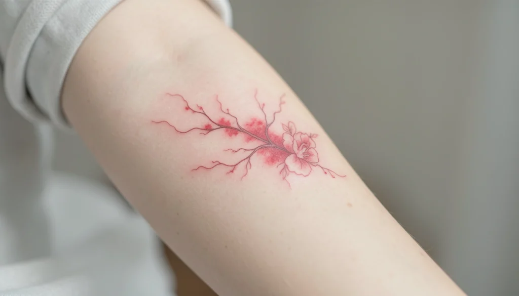
A tiny single red blossom reads clearly at wrist size because its saturated hue creates a crisp silhouette, which is why delicate red ink tattoos can be so striking in small formats. The color choice affects how much detail will remain readable over time, so thinking about line weight and negative space matters up front.
Red ink behaves differently from black when scaled down, so a small motif that relies on thin lines may blur sooner than one built from compact color fields. Placement matters for movement and sun exposure, which influence how often a touch up might be useful. Considering those trade offs when you plan placement will make it easier to pick a design that ages well.
The ideas below show a range of tiny red motifs and simple compositions to compare scale, placement, and motif type. Read the notes with each pin to decide what to ask your artist and which small adjustments will help the design stay readable and personal.
17 delicate red ink tattoos to compare and consider
Tiny wrist and neck flowers
Three small floral motifs placed on the wrist and behind the neck show how the same red ink can read very differently by placement. For wrist work choose slightly bolder petal edges so the bloom keeps its shape as the skin moves. Behind the neck is a low friction area that can keep fine detail longer, but check how often the spot sees sun if you wear open collars.
Single red heart
A small red heart on the arm relies on solid fill to remain readable at a glance. For a symbol this simple, ask your artist about the saturation and whether a single pass of color or a layered fill will give you richer longevity. Placement on the outer arm keeps it visible without constant friction that can soften edges.
Strawberry motif on arm
A tiny strawberry uses red as a focal color and can include small seeds or highlights in skin color. When you want micro detail such as seeds, plan for slightly larger scale or simplified seed shapes so they do not merge over time. A single color strawberry can read as playful and works well on inner forearm or ankle.
Minimal red arrow
A small arrow rendered in red is a graphic choice that benefits from clean lines and a compact head so the direction reads clearly. Consider whether you want the shaft to be a solid stroke or a series of dots in red ink. On the arm an arrow can follow natural lines and look intentional; on a finger it will need thicker line weight to hold up.
Red sun sketch
A drawn sun in red works well as a small emblem that favors simple rays and a bold center. If the pin shows hand drawn lines, ask your artist how to translate that sketch quality into pigment so the looseness remains legible. Placing this on an arm or shoulder where there is some flat surface area helps the circular form stay consistent.
Small left arm motif
A single small tattoo on the side of the arm demonstrates how minimal red accents can feel personal without dominating a limb. When the design is tiny, the crispness of the outline and the density of color matter most. If you want a more subtle look, discuss diluted red tones with your artist but be aware that lighter tints may fade faster.
Red florals near the torso
Red flowers on the side of the stomach use a vertical placement that follows body contours and can be scaled to match movement. For areas that stretch with breathing and weight shifts choose compact petal clusters rather than long, thin stems. This placement can be hidden or revealed easily by clothing which helps control sun exposure.
Bird sketch with red feathers
A bird drawing that features red feathers uses color selectively to create focal points within the form. Selective color like this keeps the overall tattoo delicate while letting red guide the eye. If you want movement in the piece, ask about slight variations in red saturation to suggest light and texture without increasing line complexity.
Small wrist arrow pair
Two tiny arrows placed on the wrist and hand show how paired elements can create a visual rhythm. When you place similar small motifs on separate nearby locations, make sure the scale matches so they read as a set. Discuss how the wrist movement might affect line crispness and whether a bit more weight will improve longevity.
Red ink star drawing
A simple red star drawn on paper translates to a tiny tattoo that will read well if the interior is filled or the outline is bold enough. For very small stars consider filling the shape rather than relying on fine outlines. Placement on a hand edge or the ankle gives a graphic accent but expect some fade in high use areas.
Watercolor inspired flowers and butterflies
Sketch like florals and butterflies in red ink can emulate watercolor with loose edges and varied saturation. To keep the effect while using red pigment, ask the artist about layering and where to leave skin as negative space. Larger motifs will better capture a watercolor effect while tiny pieces will need simplified shapes to avoid muddiness.
Wrist placement small motif
A person with a small wrist tattoo highlights how visible placement frames a delicate red piece as jewelry rather than a large graphic. Choose proportions that suit your wrist circumference; too large and the image loses delicacy, too small and it risks blending into the skin texture. Try tracing a stencil on your wrist to check scale before booking.
Pink flower on leg
A soft pink flower on the side of the leg suggests how red based pinks can be used for florals while keeping a delicate look. Pink tones are essentially red diluted or mixed, so discuss pigment formulas with your artist to match the hue you want. The leg offers enough real estate to include light shading without crowding the motif.
Red heart on arm
Another small heart placed on the arm indicates how slight shifts in placement change the mood of a symbol. If you want the heart to stay vivid choose a saturated red fill and a short follow up plan for touch ups. Compare how the same symbol reads on inner arm, outer arm, and wrist to pick the mood you prefer.
Arm tattoo minimal placement
A minimal arm tattoo shows that delicate red ink can be unobtrusive while still being distinct. For minimal pieces, spacing around the motif matters as much as the mark itself. Leaving breathing room and choosing a clean silhouette will help the tattoo age with clarity and preserve its intended subtlety.
Red ink on the hand
Small red tattoos on the hand are very visible and subject to frequent washing and sun exposure which can affect how quickly the color softens. Hands often need thicker application to maintain edge quality. Talk with your artist about realistic longevity and whether you are comfortable with more frequent touch ups for hand placement.
Two red stars on paper
Two red stars flying across paper convey motion and can be adapted to small tattoos that use repeated simple shapes. When converting paper sketches to skin, confirm the scale that will retain each star as a distinct mark. Pairing stars or other repeats works well along collarbones, wrists, or behind the ear where short sequences can follow natural lines.
How to plan and protect delicate red ink tattoos
Choosing a red motif means balancing hue, placement, and line strategy. Red pigments have varied chemistry and may sit differently in the skin than black ink, so discuss pigment stability and the specific red shades your artist uses. Ask for a test area or a healed photos gallery from the artist showing small red pieces on skin tones similar to yours. Think about scale as part of the design decision. Tiny motifs with extremely fine lines are more likely to blur over time, so favor compact shapes and slightly heavier color fields if you want long term clarity.
Placement matters because sun exposure, friction, and skin movement all affect how color reads as it ages. Areas like the rib cage, behind the ear, and the inner arm see less abrasion and can preserve delicate detail, while hands, fingers, and ankles experience more wear. Aftercare also plays a role. Follow the artist advice for cleaning and sun protection. If you are concerned about long term color retention plan for a touch up six to twelve months after the original session and schedule check ins with your artist so you have a realistic plan rather than surprise fading.
Frequently Asked Questions
Red ink can fade differently than black because pigment saturation, formula, and how the skin accepts color all vary by shade and brand. Some red pigments are softer and may lose vibrancy sooner, while others are formulated for longevity. Factors that matter include placement, sun exposure, your skin type, and aftercare. Discuss pigment choices with your artist and plan for a possible touch up to maintain the hue.
Yes, delicate red ink tattoos can work on darker skin tones but the way the color reads will depend on contrast and saturation. Artists often adjust pigment choice and scale so the motif remains visible. Brighter or more saturated reds can show as warm tones, while muted reds may be subtler. Consult with an artist experienced in color work on a range of skin tones so you can see examples and choose the right shade and size for your skin.
Pick a size that balances detail with longevity. For delicate motifs avoid extremely thin lines under two to three millimeters when possible, because very fine strokes can spread and blur over time. If your design includes tiny seeds, dots, or text, slightly increase the overall scale so each element remains distinct. Try a temporary marker test at the intended size and placement to preview how it reads while your skin moves and in different lighting.
Bring clear reference images and explain which qualities matter most to you such as bold fill versus fine line, saturated red versus soft pink, or stationary composition versus flow with the body. Specify the placement and expected size and ask the artist what they would change to preserve clarity. Request healed photos of similar work and ask about pigment brand and touch up policies so you leave the consult with a practical plan.
Combining red with black line work is common and can improve definition for small pieces, because black provides contrast and red adds color interest. Artists will often outline in black and fill or accent in red to keep shapes crisp. Talk to the artist about whether you want black to remain a dominant structural element or if you prefer a softer integrated look where red interacts more subtly with thin black lines.
Standard aftercare for small colored tattoos includes gentle cleaning, a thin protective ointment or recommended product, and keeping the area out of strong sun while it heals. Avoid abrasive activities and direct chlorine exposure for the initial weeks. Once healed, use broad spectrum sun protection to slow fading and consider periodic check ins with your artist for color refreshes if needed. Follow the artist aftercare exactly for best results.
Touch up frequency varies by placement, pigment, and how much sun and friction the area receives. Visible high use locations like hands and wrists often need touch ups sooner than protected areas. Some people choose a touch up around six to twelve months after initial healing to restore vibrancy, while others wait longer. Discuss expected timelines with your artist so your maintenance plan matches your lifestyle and the pigment chosen.
Delicate red ink tattoos offer many directions from tiny symbols to small naturalistic motifs, so narrow your choices by comparing scale and placement first. Save three to five favorites and note whether you prefer solid color or sketchy line, how visible you want the piece to be, and where on the body you imagine it. Take those curated references to an in person consult and ask concrete questions about pigment, scale, and expected touch up timing to leave with a clear plan for a cleaner result.