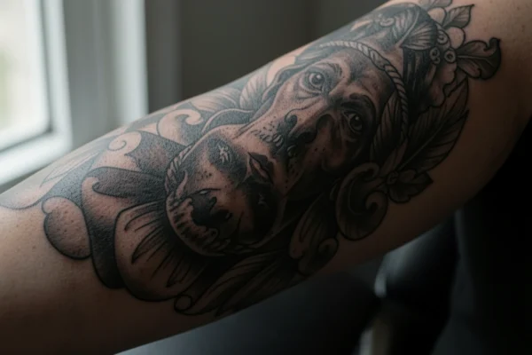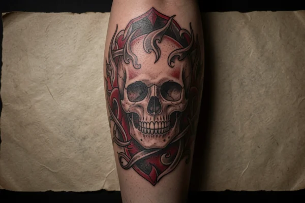
Solid black fills and strong contrast are the backbone of a bold black work tattoo because high ink saturation keeps shapes legible as the skin ages and the design settles. Choosing how much solid black to use affects readability, the amount of skin left as negative space, and how different motifs read together on the body. This matters whether you want a single statement piece or a series of connected elements across an arm or leg.
Scale and placement change what a bold black work tattoo can show without losing clarity; large fields let complex patterns breathe while smaller pieces need simpler geometry and clearer edges. Consider how the piece will sit with movement, clothing, and other tattoos so edges and heavy fills do not blur into adjacent work. A clear plan for spacing and the amount of black will help your artist suggest the right needle grouping and session plan.
The gallery below uses thirty one pins to show variations in motif, placement, and patterning so you can compare how solid black areas, line weight, and negative space create different moods. Read the notes under each image to decide what to save and which technical questions to bring to a consultation. By the end you will have a narrowed set of directions to discuss with an artist.
31 bold black work tattoo ideas to compare
Arm sleeve with solid shapes
The high contrast sleeve in this pin shows how bands of solid black and careful white space make an arm read as a single composition from a distance. When a sleeve uses heavy black areas, ask the artist about how much texture or dotwork to add so the surface does not become a flat block. If you plan future additions, leave deliberate margins so edges of heavy fills can be blended or framed later.
Leg placement with spaced motifs
This pin highlights tattoos placed on the lower leg where the skin curve and clothing exposure affect pattern visibility. In bold black work a leg placement can handle larger solid areas while maintaining clarity, but narrow calves may need scaled down motifs to avoid wraparound distortion. Discuss how the design will look standing and sitting to confirm balance across the muscle contours.
Arm work with graphic contrast
Black work with strong graphic contrast reads clearly in photographs and in daily life because the edges are decisive and shapes are bold. This example seems to favor clean solid fills and simple negative shapes which age predictably if applied with deep saturation rather than feathered shading. If you want crisp edges ask about lining technique and the needle sizes the artist prefers for bold fill.
Single motif line art study
A drawn flower in black and white emphasizes how a single motif can be rendered as heavy black areas or as detailed line work depending on the effect you want. For bold black work a filled petal silhouette creates a graphic statement, while thin outlines combined with solid blocks can give depth without soft shading. Ask whether the artist will adapt drawn lines into fills that hold up at the tattoo scale you choose.
Forearm focal piece
This forearm placement uses a central motif with surrounding black fields to anchor the composition visually on the limb. The forearm gives room for medium sized details while remaining visible in most clothing so it is a good spot to show contrast. Consider whether you want the black areas to wrap slightly around the arm edge so the piece reads from multiple angles.
Back panel with large fills
A back panel allows expansive solid black shapes that read cohesively at a distance and include internal negative space for images or script. Large fills on the back can be completed over multiple sessions to allow the skin to settle between passes. If you choose a back project, confirm session planning, how long each visit will take, and realistic saturation goals to avoid overworking the skin.
Hands and small scale detail
Hands and fingers present a challenge since skin there is thin and exposed; bold black work can still succeed but designs should favor simpler geometry and thicker shapes to counter faster fading. Expect touch ups will be more likely on the hands than on thicker skinned areas. Talk to an artist who has experience with hand pieces and ask to see healed photos of similar work.
Full body black and white composition
This example suggests how multiple bold motifs can be distributed across the torso and limbs while keeping a consistent black work style. When planning multiple pieces, use recurring motifs or a shared approach to negative space so the body reads as a curated collection. Bring reference images that show scale and density so your artist understands whether you want isolated pieces or connected panels.
Portrait style arm placement
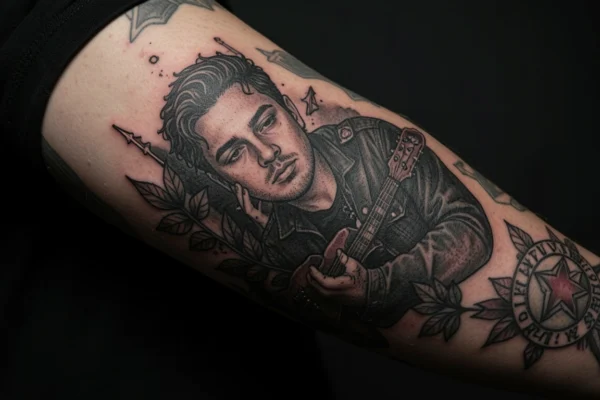
When a portrait is adapted to bold black work the result must simplify tonal transitions into blocks and selective line to preserve likeness. Large faces can be suggested through contrast and negative space rather than through fine shading. Ask your artist how they will translate soft gradients into readable black work shapes and whether they will incorporate stipple texture for mid tones.
Chest and shoulder anchoring
Chest and shoulder placements benefit from curved surfaces that can carry large black shapes and create dynamic silhouettes from different viewpoints. The collarbone and shoulder blade require consideration of how a solid black area will meet natural movement and clothing. Discuss the margin between the fill and sensitive landmarks like the sternum and armpit to avoid placing heavy blocks on locations that crease.
Graphic scorpion motif
A black scorpion drawing demonstrates how animal motifs can be stylized into heavy black silhouettes with contrasting skin detail. For intricate limbs and tails keep the main body solid and simplify appendages so they do not blur over time. If you want small claws or thin legs, plan for slightly larger scale to preserve line clarity.
Full arm pattern density
This composition uses dense patterning across a full sleeve with varied texture to prevent monotony while keeping a unified black work language. Dense sleeves require pacing during sessions so the skin heals evenly across the arm. Ask about session cadence and aftercare specific to large black fills to avoid over saturation in a single visit.
Chest pieces with contrast
Large chest work can combine lettering, imagery, and black grounds to create a central focal zone that sits well under clothing or in swimsuits. Very dark fills near the center of the chest should respect the skin texture and avoid overly thin connections between large black shapes. Bring images of desired placement and clarify whether you want symmetry across the sternum or an offset composition.
Leg spider web detail
Spider web motifs use negative space inside circular black work layouts to create contrast and a sense of depth on limbs. On a leg, the wraparound perspective can enhance the web shape but may also compress details on narrow sections. Confirm how far the design will wrap and whether portions should stop at a visual break like a knee or calf curve.
Sketch style octopus study
An octopus drawn on paper shows how organic tentacles can be converted into heavy black bands and skin tone gaps for motion and rhythm. For bold black work, convert fine internal texture into repeating negative patterns or concentric black lines so the arms remain readable. If you want tentacle detail keep the piece large enough that the inner pattern will not blur with time.
Portrait with ambient patterns
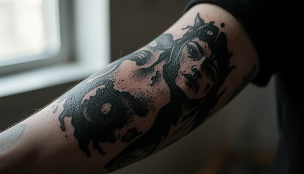
Combining portrait elements with decorative black patterns can create contrast between figurative and abstract sections within the same tattoo. Decide whether you want the portrait to be the primary feature or one part of an overall black work collage. When mixing styles ask the artist for mockups showing how each section will balance at the size you plan.
Patterned leggings inspiration
Textile patterns translated to skin can read as bold bands or repeated motifs that mimic clothing texture while remaining permanent. Use repeated motifs cautiously on curved limbs since repetition can distort on muscle movement. Sampling a small test patch or starting with a single motif helps you confirm the visual rhythm before committing to a larger area.
Full body photographic pose
A posed shot showing multiple black work pieces across arms and chest demonstrates consistency of line weight and black saturation across the body. Achieving a cohesive look across appointments requires communicating preferred fill density and edge crispness to each artist who works on the pieces. If you plan multiple sessions with different artists, compile a short brief describing ink density and negative space expectations.
Neck and shoulder detail
Small neck and shoulder pieces must consider movement and clothing friction which can affect early healing and long term clarity. Bold black work can perform well there if shapes are bold and avoid tiny connecting lines that could break up. Discuss realistic size limits and how the black will sit against collarlines or straps.
High contrast arm gesture
An arm composition with open spaces and heavy fillers shows how contrast can direct the eye to focal elements without relying on color. When choosing how much open skin to keep, think about how the piece will age since small skin islands can blur and merge with surrounding black if placed too close. Keep a bit more space than you think you need to preserve separations over time.
Striped leg sketch
Striped or banded designs on legs read strongly when the contrasts are balanced and the bands are sized to the limb. Very thin stripes can blur or require touch ups, so scale bands to the leg width for longevity. If you want a mixture of bands and imagery, test the visual hierarchy with a temporary mockup photo or stencil placement.
Minimal bird silhouettes
Simple bird silhouettes in black work are an effective way to use negative space and motion without complex detail. Small silhouettes hold up well if the shapes are kept bold and not overly intricate. Consider placement where the direction of the birds will interact with body lines to enhance the sense of movement.
Leg placement with vertical flow
Vertical motifs on the thigh or calf create a natural flow that complements limb length and posture. Bold black work can emphasize that flow by alternating solid blocks and thin negative bands to guide the eye. Ensure that the top and bottom of the piece align with natural breaks like the hip or ankle to keep the composition grounded.
Floral decorated legs
Floral motifs rendered in black play with positive and negative space to deliver a decorative effect that still reads as graphic from a distance. For flowers keep the center areas bold so petals maintain shape as the ink spreads slightly with healing. Request healed photos from the artist for similar floral scale to understand long term clarity.
Palm and hand ink study
Palm and hand work can be striking but requires acceptance of more frequent touch ups and possible fading due to skin texture and constant use. Bold shapes that embrace the skin grain and avoid tiny text or filigree will last better. Speak with an experienced hand tattoo artist about ink depth and aftercare to maximize retention.
Intricate arm centerpiece
A centered arm motif that uses both solid black and finer linework can create a focal point where the heavier black anchors more delicate details. Balance finer lines by increasing the overall scale of the piece so those lines do not blur into the black fields. Ask for a scaled stencil to preview how the thinner lines will sit next to heavy fills.
Selfie style composition
Photos of tattoos taken by the subject can reveal how a piece reads in everyday lighting and angles, which helps set expectations. Use these images to compare how your reference pieces will look on your body type and skin tone. Bring a few clear photos to your consultation and ask the artist to point out which areas might need scale adjustments.
Shoulder accent with hair contrast
Shoulder pieces will be framed by hair and clothing in many cases, so consider how contrast performs both when exposed and when partially covered. Solid black anchors on the shoulder can create dramatic silhouettes when viewed from the side. Confirm how the design will sit under common hair lengths and strap styles.
Thigh cat illustration
A cat motif on the thigh shows how representational imagery can be stylized with black work to emphasize shape and form rather than minute detail. The thigh offers room for wider compositions so you can integrate background black fields or floral framing. If you want to keep detail inside the cat, maintain a larger scale so whiskers and eyes remain distinct.
Arm collage with layered ink
Layered arm collages combine multiple motifs using overlapping black shapes and negative space to create a unified sleeve language. Plan the visual layering so key elements do not end up visually lost under adjacent fills. When possible, request a composite mockup from your artist that shows how meetings between different motifs will be handled.
Full coverage arm texture
An arm covered with a dense mix of black and white texture is a commitment to a strong visual presence and requires maintenance planning. Texture can be created through dotwork, small open areas, and patterned fills that contrast with large black blocks. Discuss long term care and touch up possibilities to maintain crispness where small pattern meets solid black.
How to plan a bold black work tattoo in practice
Start by choosing a primary goal for the piece such as making a single bold statement, creating a patterned sleeve, or adding a complementary accent to existing tattoos. That goal determines scale, density, and how much negative space you keep. If you want a single statement piece you may favor large solid fields and simplified motifs, but if you plan a sleeve choose recurring patterns and a consistent approach to edge work so the whole arm reads as one work.
Next, prioritize communicating technical preferences during a consultation. Ask about the artist’s approach to saturation, needle grouping, and session cadence because these affect how dense black areas will heal and whether the skin will tolerate large fills in one visit. Bring reference images that show both overall layout and close up examples of the texture and line weight you like, and be explicit about touch up expectations so you and the artist share a clear plan for how the final piece will develop.
Frequently Asked Questions
Choose placement based on how visible you want the tattoo and how much flat surface the area provides for solid fills. Larger surfaces like the back, chest, thigh, and upper arm offer more room to execute heavy black shapes without distortion, while hands and fingers demand simpler geometry because the skin there is thin and mobile. Consider clothing, work visibility, and whether you want the piece to wrap around curved anatomy. Also discuss how movement will change the way black blocks meet at joints so the artist can adjust the layout.
Scale depends on detail level and long term readability. If you plan intricate interior patterns keep the piece large so the interior lines remain distinct, while simpler silhouettes and geometric blocks can be smaller and still read well. For sleeves or panels balance solid black fields and negative space so the eye can find focal areas. Ask your artist to show mockups at the expected size and to explain which details will be lost if scaled down.
Large black fills are generally forgiving but they can require touch ups to maintain saturation and edge crispness, especially in areas exposed to friction or sun. Hands, feet, and places with thin skin often need more frequent maintenance. The need for touch ups also depends on ink depth, the artist’s technique, and your aftercare. Discuss a maintenance plan with your artist and ask for examples of healed work over time to set realistic expectations.
Adapting a drawn reference requires simplifying gradients into areas of solid black and thoughtful use of negative space to suggest mid tones. Your artist can translate delicate shading into stipple texture or patterned negative areas without relying on soft gray transitions. Provide the reference and ask the artist to produce a stencil or digital mockup that shows how the major shapes will change at the chosen scale. This step prevents surprises about lost detail or shifted emphasis.
Mixing bold black work with colored tattoos is possible but requires careful planning to avoid overpowering the colored pieces. Place heavy black areas so they do not sit directly over small color elements you want to preserve and use negative space or framing to create visual separation. Consider whether you want black to act as background or as separate panels. Talk to your artist about integration strategies and whether any color may need a buffer zone to avoid being visually absorbed by adjacent black.
Ask about their experience with large black fills, the needle sizes they will use, session length, and a realistic plan for saturation that protects the skin. Inquire how many sessions the artist expects, how long each session should be, and whether they recommend spacing sessions to allow thorough healing. Request healed images of similar scale so you can assess how their technique maintains edge definition. Also discuss aftercare specific to big fills and whether a touch up is included later.
Bold black work tends to read strongly across a wide range of skin tones because of deep contrast, but differences in undertone and contrast level affect how details appear. On very deep tones the black may merge more with skin, so artists rely on crisp edges and negative space to create separation, while on lighter skin a wider range of internal patterns and thin negative lines may be visible. Show the artist your skin in natural light and ask for mockups or stencils on your skin to preview how the design will contrast with your natural tone.
Choosing between graphic fills, patterned sleeves, and bold singular motifs will narrow your options fast when you identify whether you want scale or fine detail to last longest on the placement you prefer. Save a small selection of favorites from the gallery and note what you like about each one, such as edge crispness, negative space use, or motif scale, before you talk with an artist. The most useful takeaway is to decide on scale and density first, then let your artist adapt style details so the final bold black work reaches both your aesthetic and practical goals.